Explore kinetic energy diagrams that show how energy moves and changes. Visual guides to help you understand KE, PE, and energy conversion.
A kinetic energy diagram shows how motion energy depends on mass and speed, or how it trades places with potential energy. The two diagrams below cover both: the formula diagram shows why speed matters more than mass, and the hill diagram shows energy changing form as an object moves.
Key facts:
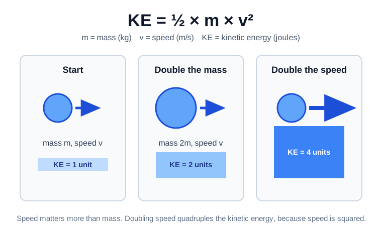
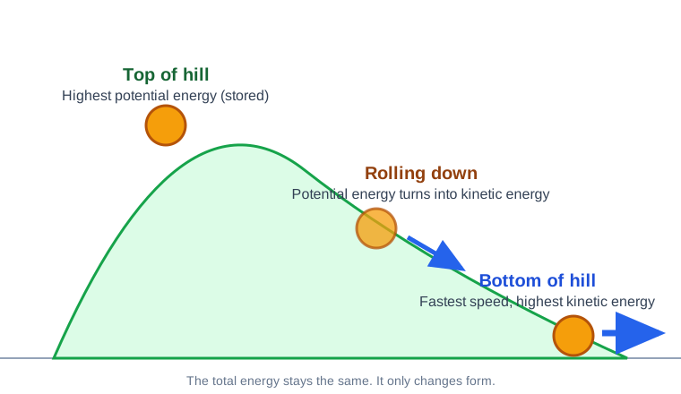
This is the most important diagram for kinetic energy. It shows how KE changes as speed changes.
Draw a graph. Put speed on the bottom axis (x-axis). Put kinetic energy on the side axis (y-axis). Now plot points.
At 0 m/s, KE = 0 J. At 1 m/s, KE = 1/2 x m x 1. At 2 m/s, KE = 1/2 x m x 4. At 3 m/s, KE = 1/2 x m x 9. At 4 m/s, KE = 1/2 x m x 16.
Notice the pattern. When speed goes up by 1, KE jumps by larger amounts each time. This makes a curved line that goes upward. It is not a straight line.
For a 1 kg object:
The curve gets steeper as speed increases. This shows why speed has such a big effect. Going from 4 m/s to 5 m/s adds more KE than going from 1 m/s to 2 m/s.
Diagrams for younger learners should be simple and clear.
The Energy Bar Chart
Draw a bar for KE and a bar for PE. At the top of a swing, the PE bar is tall and the KE bar is short. At the bottom of a swing, the KE bar is tall and the PE bar is short. The total height of both bars stays the same.
The Energy Pie Chart
Draw a circle. Color part for KE and part for PE. At the top of a hill, most of the pie is PE (a big slice). At the bottom, most is KE. The whole pie stays the same size. Only the slices change.
The Position Diagram
Draw a simple roller coaster with three hills. Label the top of each hill with PE. Label the bottom of each drop with KE. Add arrows showing energy moving from PE to KE and back.
The Simple Graph
Draw a picture of a ball falling. Next to it, draw two arrows. One arrow for PE pointing down (getting smaller). One arrow for KE pointing up (getting bigger). At the bottom, the PE arrow is gone and the KE arrow is big.
This is a classic diagram. It shows how PE and KE trade places on a roller coaster.
Draw a roller coaster track with several hills. The first hill should be the tallest. Label five key points.
Point A: Top of the first hill. The car has maximum PE and minimum KE. It is barely moving. Label PE = high, KE = low.
Point B: Bottom of the first drop. The car has minimum PE and maximum KE. It is going fastest. Label PE = low, KE = high.
Point C: Top of the second hill. The car has more PE again, but not as much as Point A. Some energy was lost to friction. Label PE = medium, KE = low.
Point D: Bottom of the second drop. KE is high again, but lower than Point B. Label KE = medium.
Point E: The end. All energy has become heat from friction. Label KE = 0.
Below the track, draw bars showing total energy at each point. The total bar gets slightly shorter at each point (energy lost as heat). But PE + KE always equals whatever energy is left.
A pendulum is great for showing energy conversion.
Draw a pendulum at three positions.
Position 1: Far left. The bob is at its highest point. It has maximum PE and zero KE. Label PE = max, KE = 0.
Position 2: Bottom center. The bob is at its lowest point. It has zero PE and maximum KE. Label PE = 0, KE = max.
Position 3: Far right. Same as Position 1. The bob is high. PE = max, KE = 0.
Draw arrows showing the energy conversion. From 1 to 2, PE turns into KE. From 2 to 3, KE turns back into PE.
Add a bar chart next to each position. Show the PE bar in one color and the KE bar in another. The total height stays the same at every position.
Now let us add numbers to the diagrams.
Diagram: KE as a Function of Mass
Draw a graph with mass on the x-axis and KE on the y-axis. For a fixed speed, this is a straight line. At 5 m/s:
The line is straight because KE and mass have a direct relationship. Double the mass, double the KE.
Diagram: KE as a Function of Speed Squared
Draw a graph with v squared on the x-axis and KE on the y-axis. This time, the line is straight. That is because KE = 1/2 x m x (v squared). If you plot v squared instead of v, you get a straight line through zero.
For a 2 kg object:
The straight line shows that KE increases at a constant rate with v squared.
Flow diagrams show how energy moves from one form to another.
A Simple Flow: Dropping a Ball
Gravitational PE (at top) goes to Kinetic Energy (while falling) goes to Sound + Heat (on impact).
Draw this as boxes with arrows between them. Label each box with the energy type. Add a note that the total energy is conserved.
A Complex Flow: A Car
Chemical PE (fuel) goes to Thermal Energy (engine combustion) goes to Kinetic Energy (pistons) goes to Rotational KE (crankshaft) goes to Translational KE (car moves).
But wait. At each step, some energy becomes waste heat. Draw small heat arrows coming off each box. This shows inefficiency.
A Power Plant Flow
Nuclear PE (uranium) goes to Thermal Energy (reactor) goes to KE (steam) goes to Rotational KE (turbine) goes to Electrical Energy (generator).
Each step is a conversion. The total energy stays the same, but the useful energy decreases with each step.
Different situations need different diagrams.
Use a KE vs speed graph when you want to show how speed affects KE. The curve shows the squared relationship.
Use a bar chart when you want to compare KE and PE at the same time. The side-by-side bars make comparison easy.
Use a pie chart when you want to show the proportion of KE to PE. The slices show the split clearly.
Use a track diagram when you want to show energy along a path. Roller coasters and pendulums work best here.
Use a flow chart when you want to show energy conversion steps. Power plants and engines work well.
Discussion Questions
Classroom Activity: Draw Your Own
Give students a scenario (a bouncing ball, a roller coaster, a pendulum). Have them draw three diagrams: a bar chart, a position diagram, and a flow chart. Compare the diagrams and discuss which one is most helpful.
Common Misconceptions
Some students think diagrams show the actual energy. They show representations of energy, not the energy itself.
Some students think the KE bar can be taller than the PE bar. The bars can be different sizes, but the total stays the same.
Some students think the line on a KE vs v graph should be straight. It curves because v is squared.
Last updated: September 14, 2026
1. On a KE vs speed graph, the line is what shape?
2. In a roller coaster diagram, KE is highest where?
3. A pendulum at its highest point has mostly what?
4. In a bar chart of a falling ball, which bar shrinks?
5. What does a pie chart of energy show?
What does a kinetic energy diagram show?
A kinetic energy diagram shows how KE changes with speed, mass, or position. It can also show how KE and PE trade places in a system.
How do you draw a kinetic energy diagram?
Draw a graph with speed or position on the bottom and energy on the side. Plot the KE values at different points and connect them.
What is a KE vs speed diagram?
It is a graph showing how KE increases with speed. Since KE depends on speed squared, the line curves upward, not straight.
What is a roller coaster energy diagram?
It shows PE at the top of hills and KE at the bottom. A bar chart next to the track shows how the two energy types trade places.
How do pendulum diagrams show energy?
A pendulum diagram labels KE as highest at the bottom of the swing and PE as highest at the ends of the swing. It shows energy swapping.